Jason Watts | artist
Recent Work
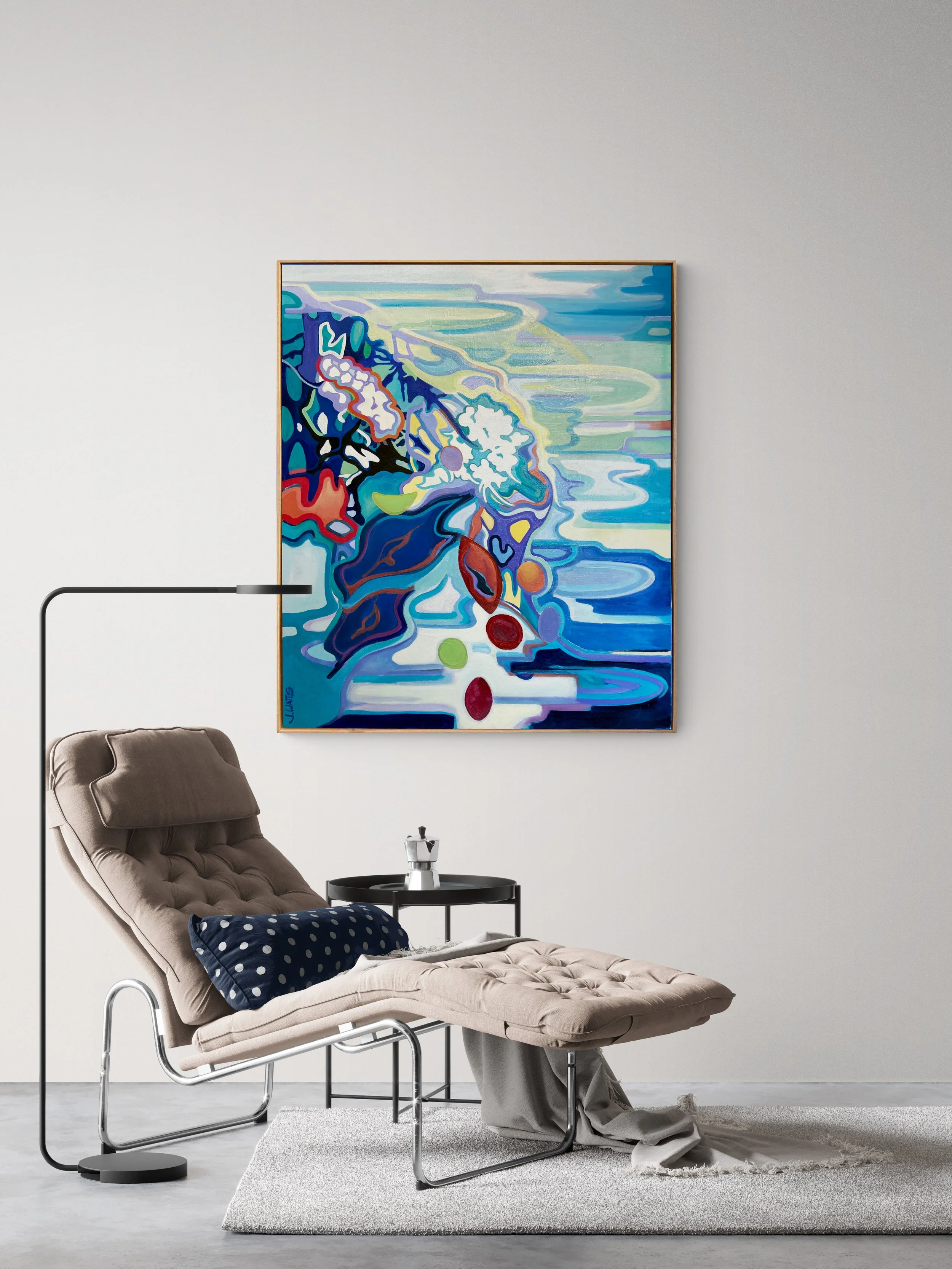
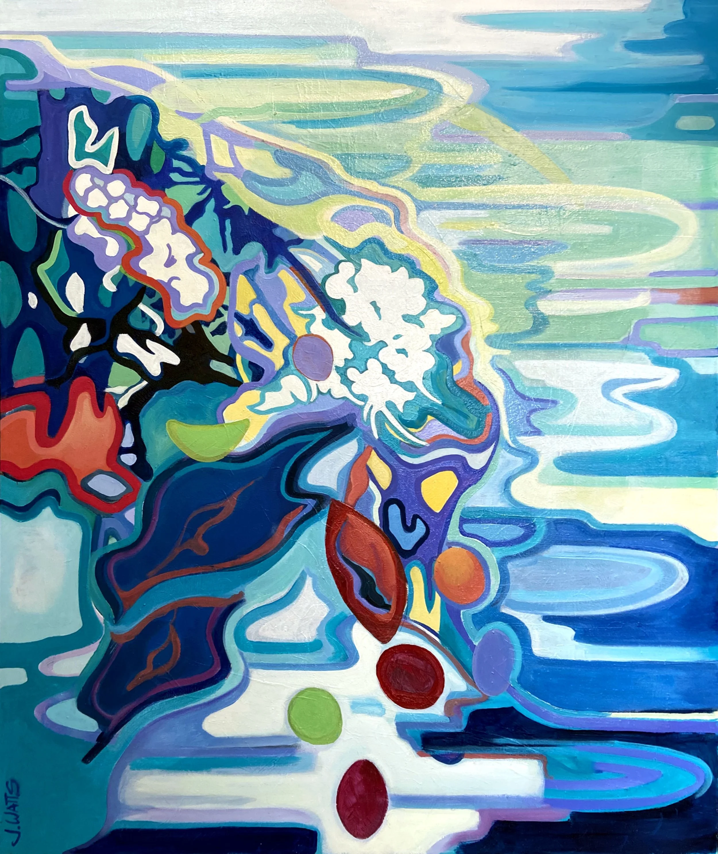
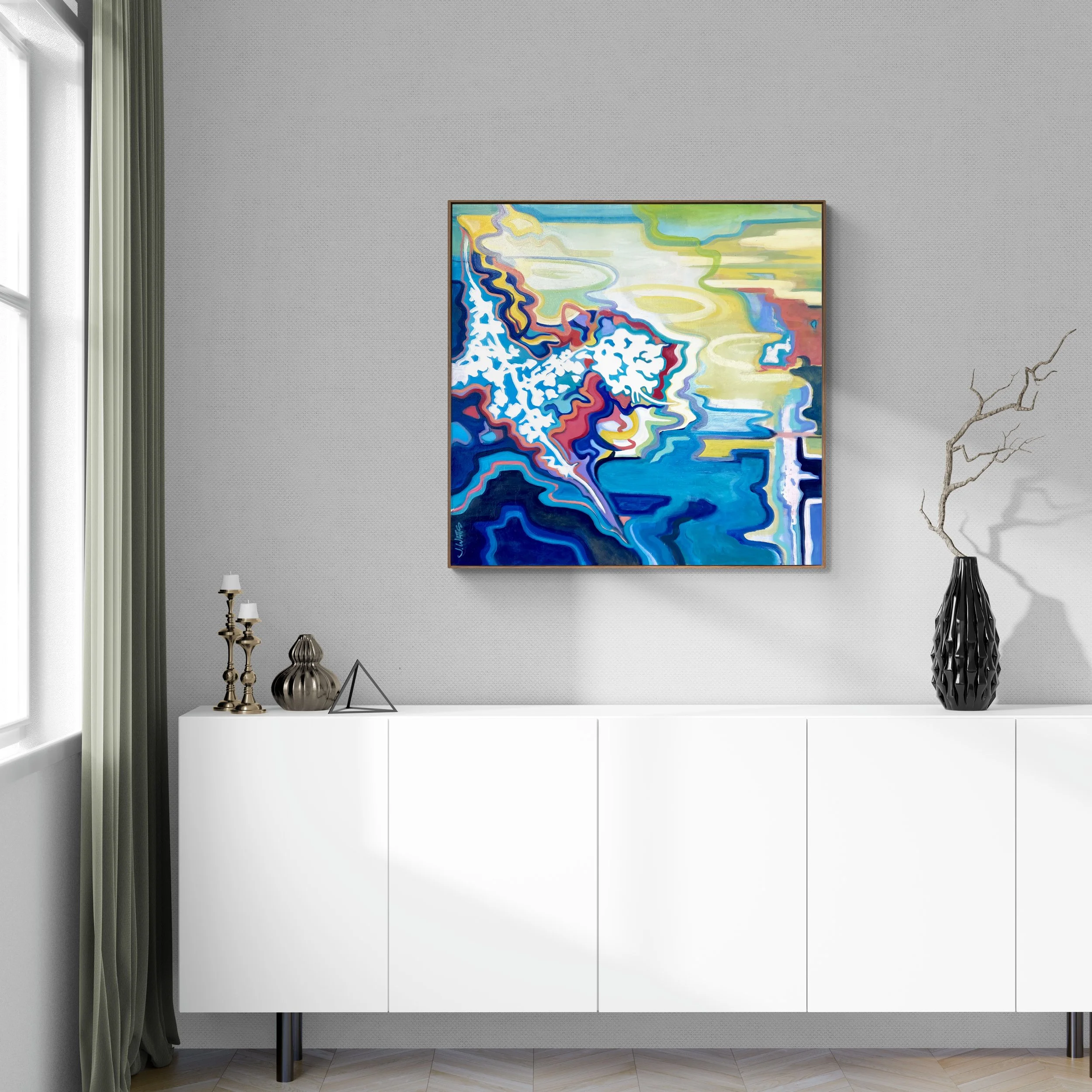
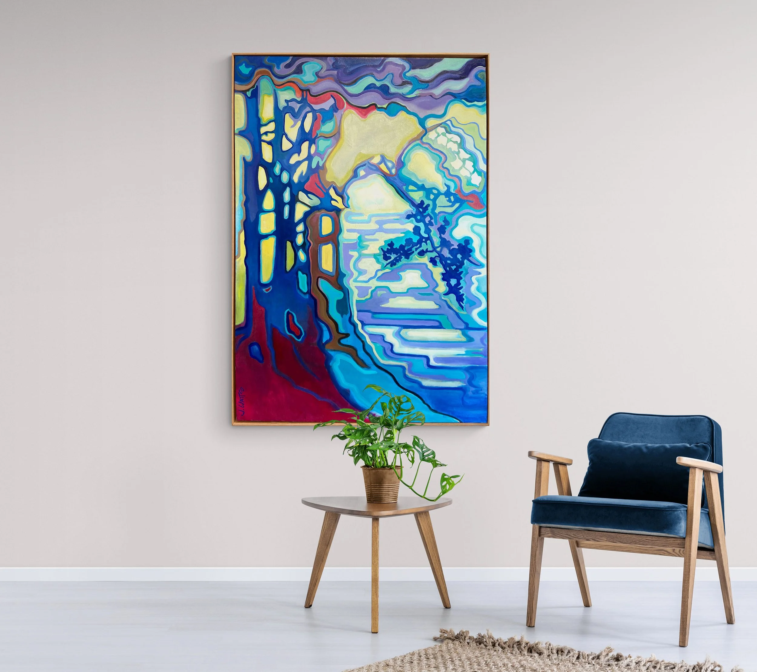
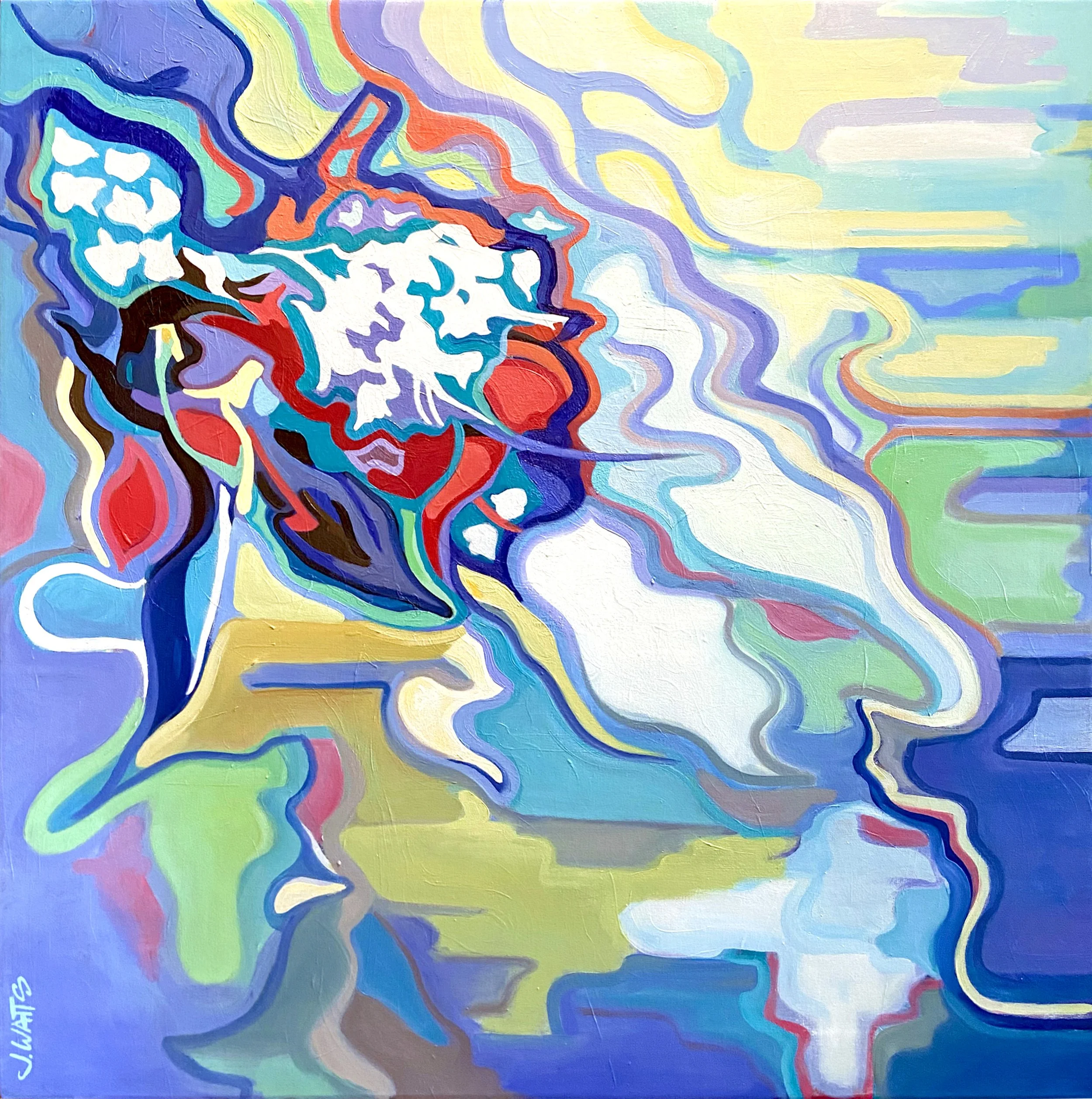

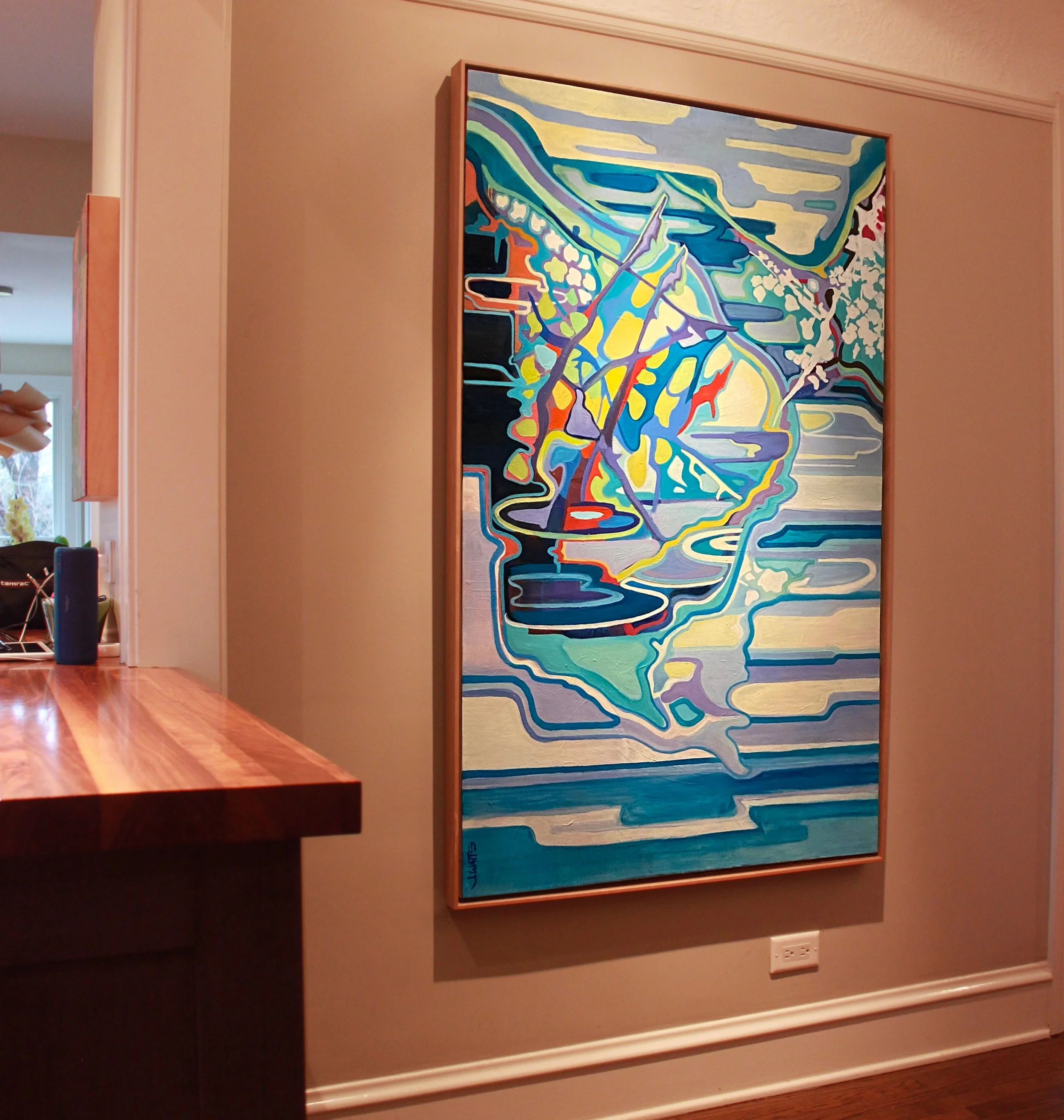


Utilizing silhouettes and a process of color blocking silhouettes and shapes, I’m especially interested in the graphic quality and color harmony in these works.